A new image for a modern research platform: Pilotly
Creative Direction, 3D Illustration ✦ 2023Pilotly replaces traditional, antiquated research methods with modern, technology-forward solutions.
As a platform, Pilotly offers a variety of research services: virtual focus groups, episodic testing, audio/podcast testing, tagline testing, streaming user experience, and many more. Their customers have an international presence: Amazon Studios, Vevo, Viacom, Sony Pictures. These businesses all use Pilotly to understand how they can release the best, most competitive content for consumers.
As a small team, Pilotly competes with big consumer research companies. The team wanted to scale up their platform and gain more users. Because of this, they started with rebuilding their website to better represent who they are and what they do. They brought my team onto the project to help with the branding and visual imagery.
Team
Project management: Saad Hassan, Joe Audette3D Design: Nicole Garcia, Eric Ruperto, Chandler Gassman2D Design: Nicole Garcia, Chandler GassmanWebsite Design: Masumah ZahraAnimation: Nicole Garcia, Eric RupertoStarting with the strategy
To determine how to position Pilotly’s new brand, we started with research.
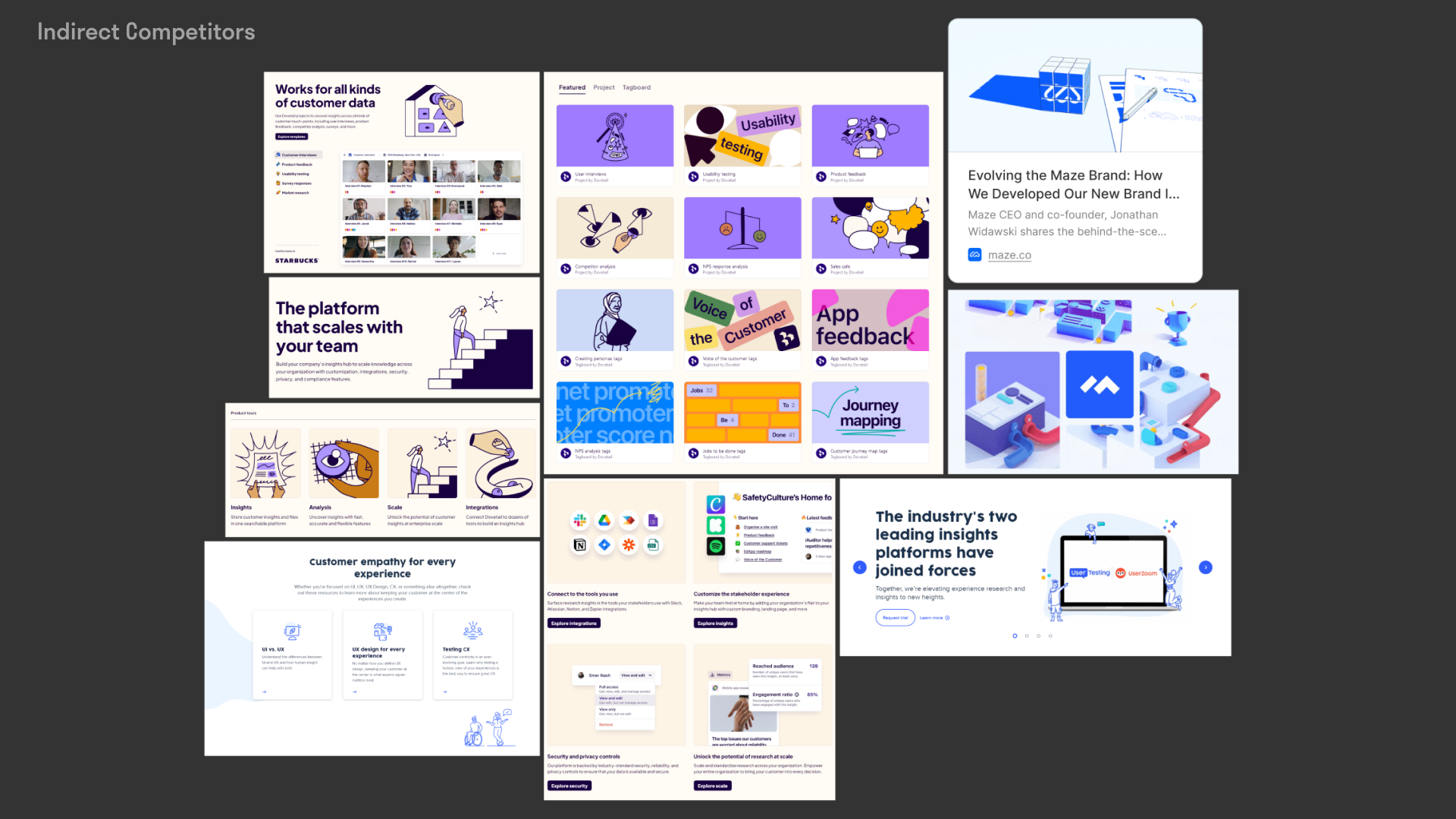
We first interviewed key stakeholders to understand Pilotly’s internal landscape: each of the services they offer, who they work with, what their roadmap looks like. Then, we looked at competitors. The competitive research showed us how other companies in a similar niche positioned themselves when it came to visuals, messaging, and strategy.
Lastly, we did an audit of Pilotly’s current brand. The Pilotly team expressed interest in a new direction for their brand, but we still wanted to form a baseline understanding of what we were starting with. This understanding served valuable in the next stage, as we could test various ideas for the creative direction, to see if those ideas would scale well.
Creative Direction
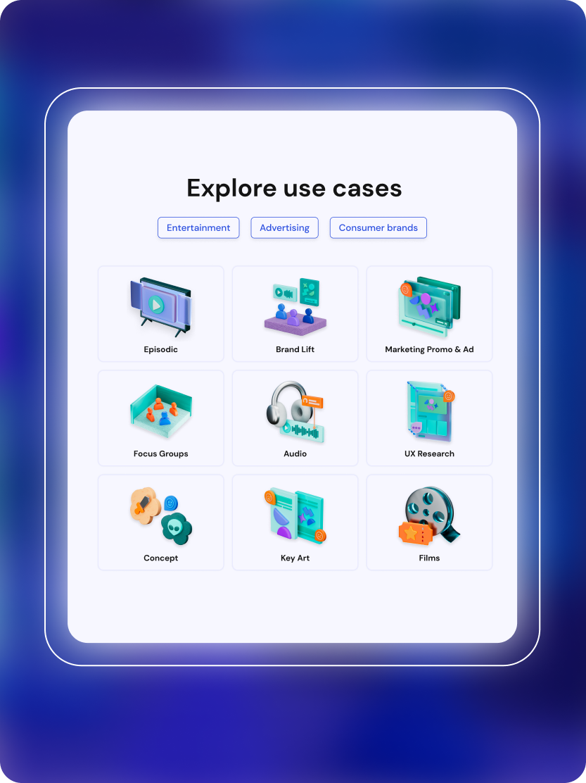
For the website redesign, the Pilotly team needed brand visuals for the following pages: the homepage, the page covering Pilotly’s use cases, and the page about Pilotly’s platform. After assessing the scope of work, we decided to start with the Use Cases.
Illustration Principles
To maintain cohesion, we outlined principles that would guide the development of the illustrations. Those were:
Balance conceptual and literal
We wanted the visuals to do meaningful work in communicating Pilotly’s offerings, rather than only being visually appealing. The graphics should pair well with accompanying copy in solidifying the message for the viewer.
Balance personality and content
It was the team’s fresh take on research that resulted in what Pilotly is today. We wanted to bring that same mindset to the visuals, integrating touches of play and inventiveness wherever possible.
Practice modularity
Each illustration should contribute to the overall illustration system. Therefore, the visuals should be designed with the future use of being repurposed and reused, from marketing assets to within the product.
Finally, from here, we worked on developing the visuals for each of Pilotly’s use cases.


